Back
Leading Edge Only
Brand development and digital update for the world’s largest global innovation platform.
The Brief
Having worked with SOtechnology for over 3 years, Leading Edge Only engaged with our senior team to discuss a re-branding project. Over the course of 3 years the business had grown significantly, had some change of strategy and increased in the amount of competitors were in it’s vertical.
Therefore the brief to SOtech was to not only update the branding (logo, fonts, colours) but also to re-look at the key areas of the website layouts and nomenclature to better articulate what it was that LEO do and how they do it.
Finally they wanted the website to include specific tools for their users to help them find and identify suitable products.
The solution
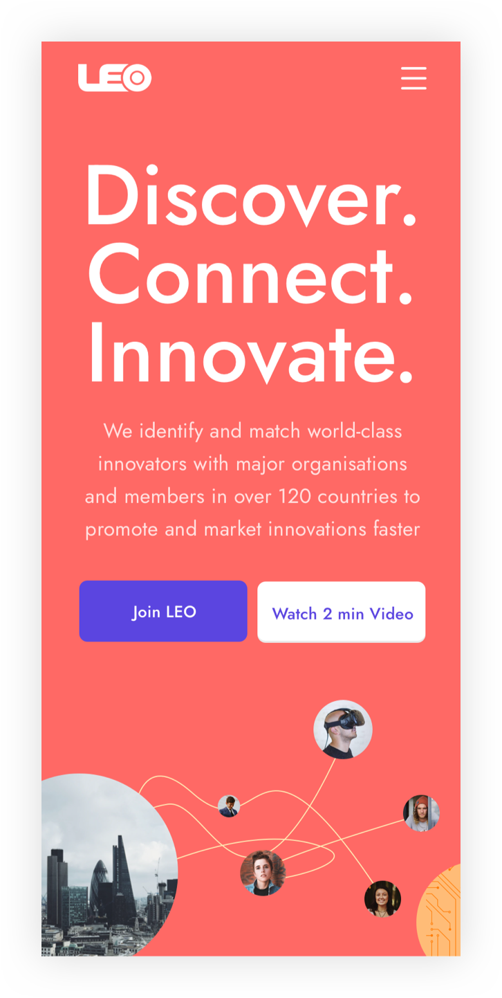
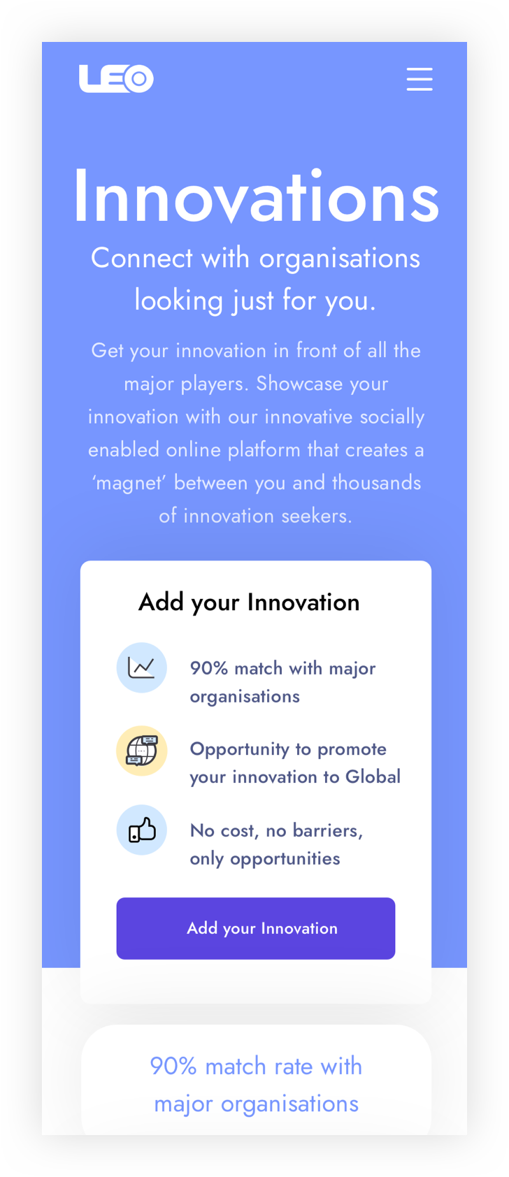
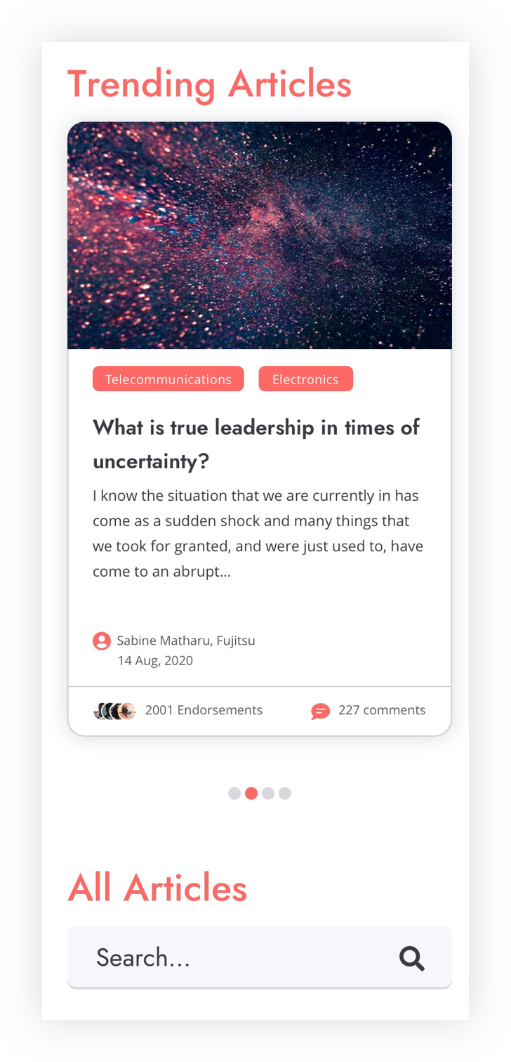
SOtech’s MD and Creative Director ran 3 separate discovery and strategy sessions alongside the key stakeholders of the LEO business. These sessions were designed to delve deeper into the different customer persona’s of the LEO brand and also to challenge the current thinking of how the brands ‘product offerring’ was articulated and displayed. Throughout these sessions the SOtech team were able to identify simple and powerful solutions to help customers to understand the company and processes better, and ultimately drive users to the correct place and to ultimate convert.
Complete overhaul of brand colours
By choosing a modern palette and colour scheme that could be used to signpost and draw attention to the key selling points and CTA’s across the site.
Simplified wording and signposting
To better explain what LEO offers for it’s 3 key customer persona journeys.
Better use of graphical illustrations
Knowing photography can become aged very quickly we wanted a more graphical solution to keep engagement and draw users through the process easily.
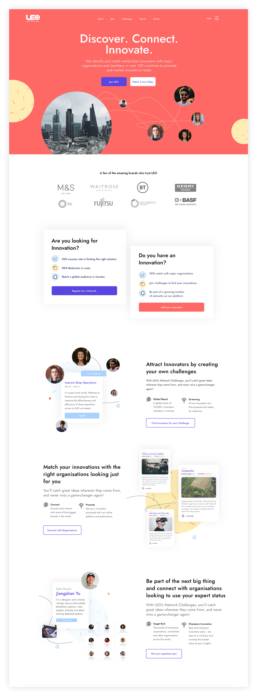
New Navigation Structure
Again to ensure the primary objectives of the site were met through clear design and signposting to sit alongside the rest of the homepage and website.
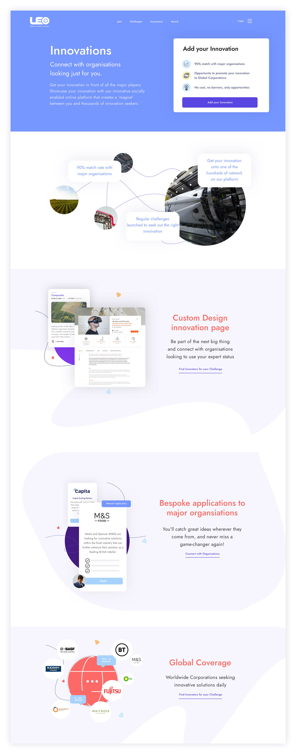
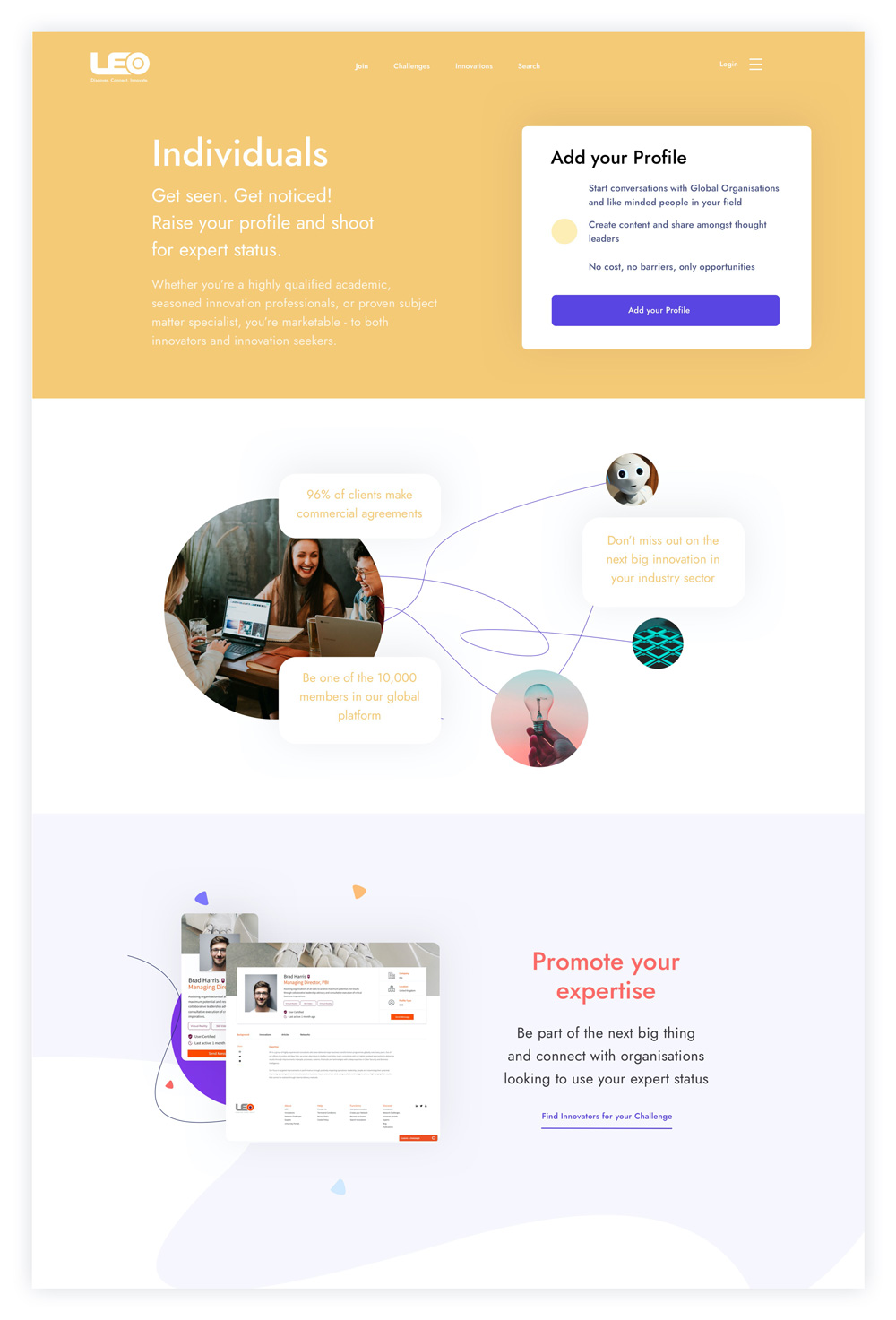
The Results
Leading Edge Only were not only delighted with the new look and feel of the website, they also rolled the changes out across their entire estate prior to launching their crowdfunding project. We have subsequently continued to work with the brand on new elements and sections of the site to continue to roll the new design thinking out further.
